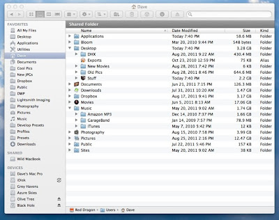
Wow. Microsoft just revealed the design of the Windows 8 explorer (file browser). Holy shit. What an absolute mess. What is it with those "ribbons" that they like so much? They've brought them over from MS Office...I didn't like them there, and I like them even less here. Why is it that Microsoft is so enamored with clutter? Is this gaudy interface really what users want to stare at all day long, every day? I know I wouldn't.
When it comes to the user interface, I'm of the mind that simpler is always better. A minimalist "Zen" computer screen is more tranquil and less distracting, and easier on the eyes as well. Someone needs to tell that to uncle Fester. Or perhaps he's just not listening.


No comments:
Post a Comment